BioMune™ Bottle Label. If you like what you see feel free to reach out to me and tell me about your personal project, I'll get you a free quote.
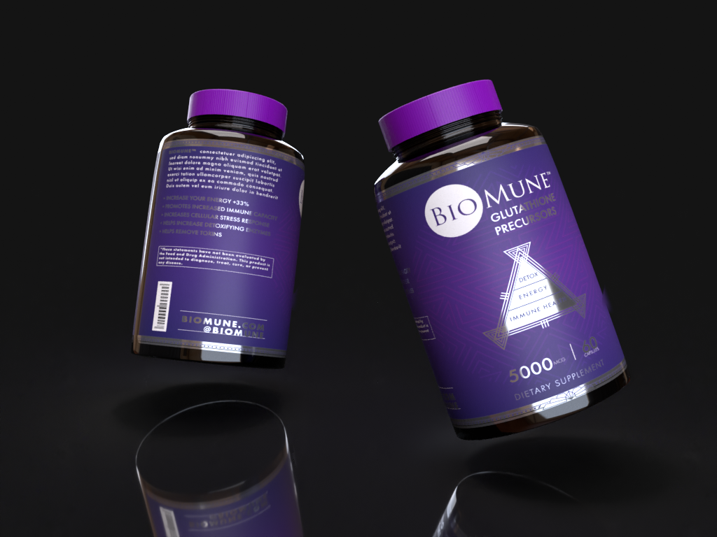
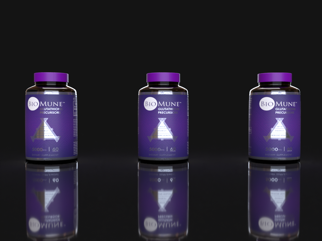
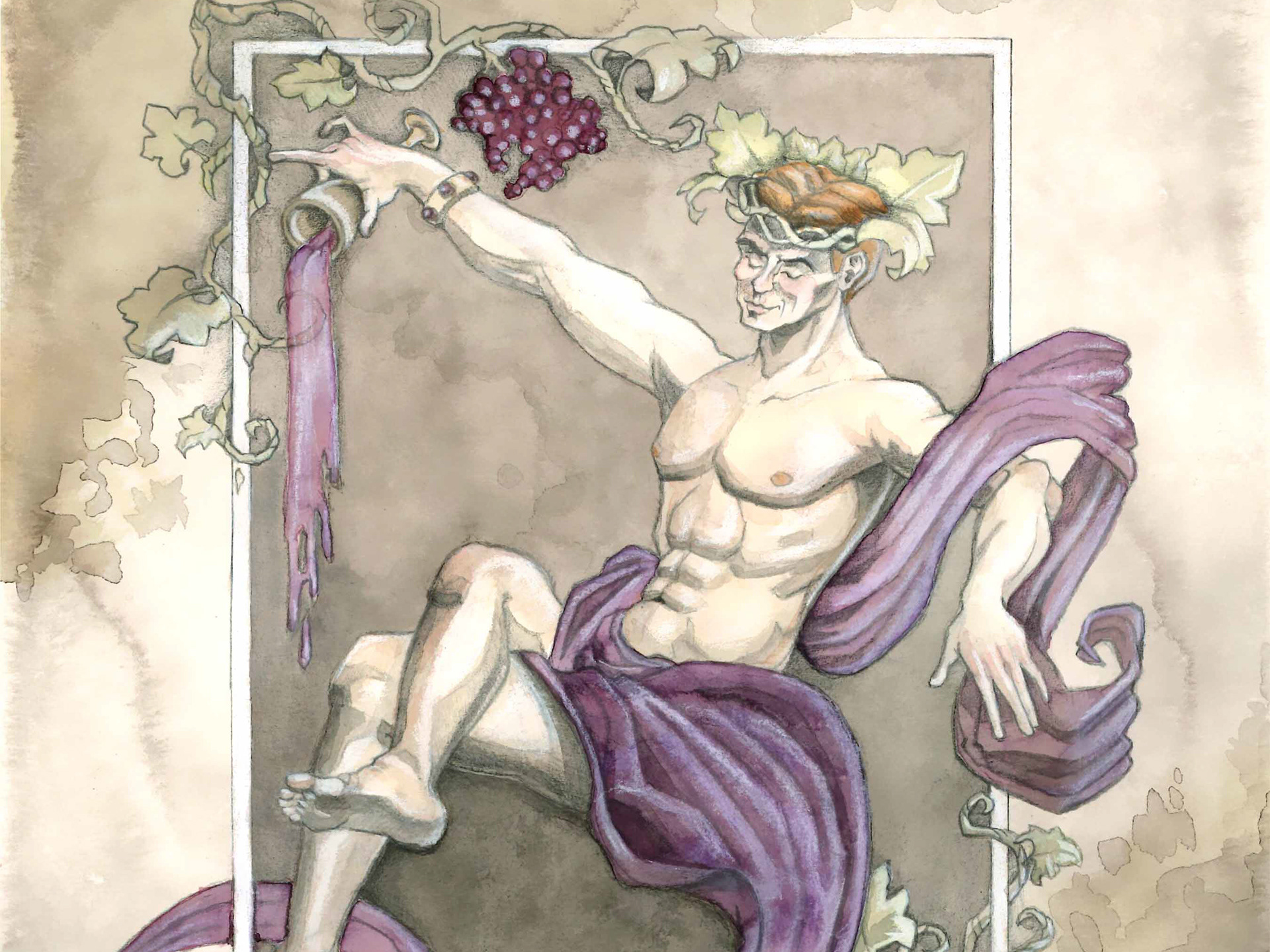
At Seth Keller Creative Solutions, we're dedicated to crafting design experiences that enhance the products we touch. One such project was our collaboration with BioMune, where we reimagined their supplement bottle labels to evoke a sense of wellbeing and creativity. Our choice of violet as the dominant color was no accident. Violet is not just a color; it's an embodiment of balance, healing, and imagination. It exudes a feeling of tranquility and sparks the fires of creativity. Our label design seamlessly integrates these qualities, inviting consumers to associate the supplement with a holistic sense of wellness. We believe that design is not merely aesthetic; it's a conduit for emotions and experiences. With our BioMune™ supplement bottle label design, we aimed to inspire healthier, more creative lives.
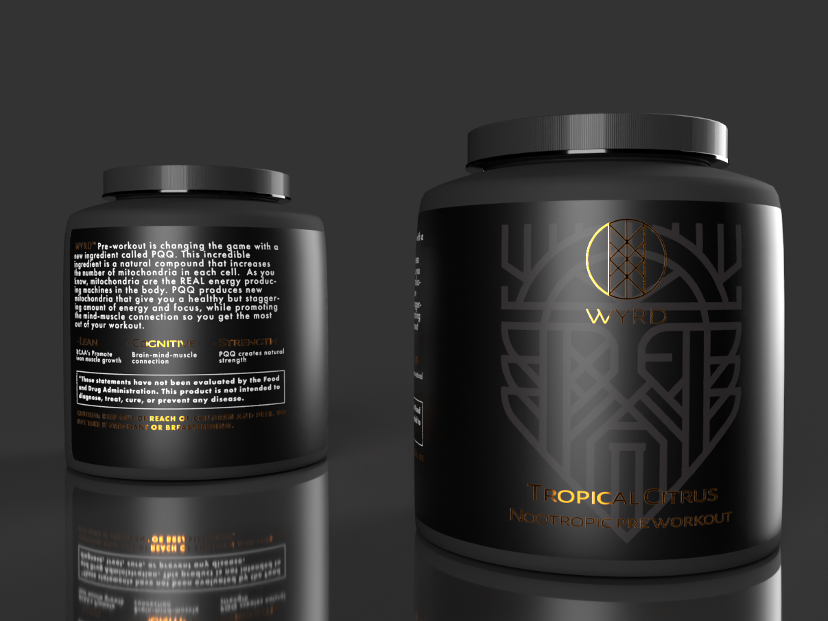
Incorporating creative elements, such as silver foil highlights, can significantly impact customer interaction. Studies have shown that these exquisite details not only capture attention but also foster a deeper emotional connection with a product. In fact, our clients have experienced an impressive increase in customer engagement when silver foil highlights are introduced into their designs.
